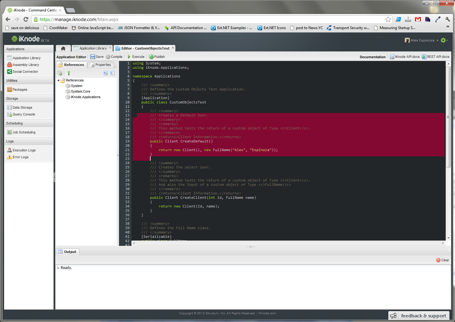
New Code Editor Theme
We have been focusing so hard on making the platform bug-free and fast that we have neglected the User Interface for a while, specially the Code Editor. So we decided to give a little love to the UI.
We had been using the default theme which defaults to the Monaco font (if you have it) on the editor. The problem is that the Monaco Font is created for a font rendering scheme that focuses on the shape of the font which looks blurry sometimtes like the Mac OS. But when you are developing in windows, Monaco looks too blurry, because Windows rendering algorithm forces the font into pixels. So we decided to put Consolas first (which looks amazing on Windows Systems) and then Monaco (which looks amazing in *nix and Mac).
We also decided to change the colors to match the site colors, and preferred a dark background. We created our own theme which we think it is pretty cool.
Let us know what you think. Here is an screenshot of the new theme:

