Announcing the New Documentation Site
Today we are announcing the new documentation site. We have been adding a lot of content lately to the documentation, and we have been complaining about how the structure wasn’t useful enough. The old design was just too cluttered and complicated.
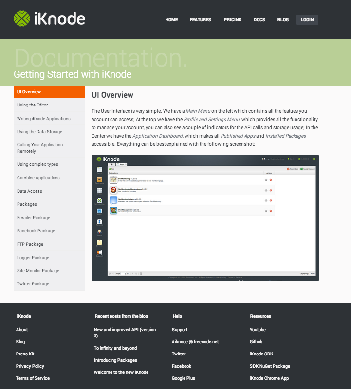
The new design is clean and very well structured:

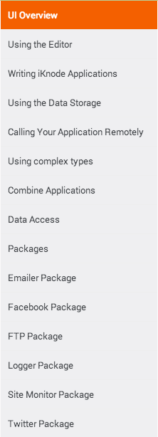
With this new design we strived to improve the usability and structure to make it easier to navigate and read. The navigation was one of the most important improvements we added. Before it was just a simple Octopress menu, now it is a minimal but powerful side bar.

The content is also less cluttered, now that it is divided into several pages, instead of having only one page for all. At the beginning, we thought having it all in one page would be easier for the user and for us to read and look for, but as it grew, it became too much. Multiple pages encapsulates the content better and it also helps you focus on what you are trying to learn.
Go check the documentation site yourself and let us know what you think.
