To Infinity and Beyond

We started working on changing the Web in 2011 with the creation of iKnode. Our dreams filled our heart and our soul with the vision to make distributed systems via web services at every developers reach. We dreamed of recent graduates building their dreams on the web. Back then it was only me (Alex), Jorge and Joel. Fully funded by ourselves. Living the bootstrap dream.


We coded for days and nights to realize the vision. To create every single building block that made the iKnode cloud. Learning from our beta users, and our testing. We were 3 at the time. With Joel doing the Graphics and the fron-end, Jorge and me working on the engine.


We saw Backend as a Service providers pop up from everywhere. It seemed like the market started to get full of competitors, and that made us feel excited, empowered even. It validate our idea, but most importantly it validated our dream. We welcomed the competition enriching the market and make it more fun.


Around May 2012, we noticed more BaaS providers started to popup. A lot of them were companies that seemed to be cloning other BaaS providers features, and most of them didn’t bring anything new to the table. The competition started to get boring.


Nothing interesting was coming out, except for one company: Spire.io. We glanced through their site, and saw a spark of new, but something about them seemed very familiar. Their passion, it seems, was the same as ours: making developers life easier by creating a serverless world. The best way to make distributed computing easy, is to remove servers. We felt the competition was getting too close this time. For a moment we were afraid, but also happy. We were not alone.


We kept a close eye on them for the following months and then dozed back in to our own product and our own vision. We began to ramp up development to release at the DEMO conference in October. With Sophie’s help, and an amazing design by Joel, we invested in T-Shirts, Stickers and swag. We were proud to wear and iKnode T-Shirt, we still are.


October (2012) came and we launched iKnode at DEMO. We were a great success, attracting a big number of users into our dream cloud. Sophie joined to run the business, which was just starting. The following months after that we kept the feedback loop active learning and learning from our users.


By December 2012, I was able to get back to market analysis. Moving away a bit from our own user base to the information on the web. The first thing my list was to check on Spire.io. I was afraid to find them ahead of us. After all we were the only providers going after the web in the same way.


So I typed on my chrome instance: spire.io….. Nothing. The site was down. I thought. It seemed crazy that a Cloud provider would allow their site to go down. So I tried again. And again I got Nothing. I checked www.downforeveryoneorjustme.com, and validated. Their site was down. Completly down. What happenned ?


I began to tirelessly look for news around the web regarding Spire.io, to see if there were any press releases, blog post, etc. Checked Hacker News first, then Reddit, then Tech Crunch, and every other imaginable tech news site. Got Nothing. Nada.


I was perplexed. I was scared even. How can a company disappear over night? I began to be very scared. What happens if our dream is wrong ? What happens if what we are looking for is unattainable ? The team at Spire.io had the answer and I had to find out.


I first sent a tweet to the @spireio account:


The CEO responded:


He was very nice, but still I needed to know more, so I insisted.


To make the story short, he contacted me over email, and we were able to talk over the phone for an hour or so. Several interesting things happened during that phone call. Not only did we had the same dream to make a serverless world, but also he is from Mexico, just like us. And he lives in LA, which is pretty close to us; we are in Orange County. I thought that was amazing. And it seemed to me to be a cosmical connection.


After I hanged up, I felt relieved to know that our dream was still attainable. Additionally I made a friend, which shares our dream. I was a happy camper.


In the following months Diego, began helping more and more to pave the way for iKnode. For the iKnode team, Diego seemed part of it already, so we decided to officially invite him to be part of the iKnode family.


Today, we are proud to announce, Diego Prats joins the iKnode team as Chief Strategy Officer. His experience and expertise is first rate in the Backend as a Service industry. He will be mainly helping to build the dream on solid ground with a real solid business framework that will hold iKnode’s feet in the ground, but keep the heart flying in the serverless clouds.

And now with a complete team, in the words of Buzz Light Year:

“To inifity and Beyond!”


Introducing Packages

We are so excited to announce the availability of a new iKnode feature: Packages. With Packages we provide a prebuilt set of applications for you to use directly through the API or through your own your applications.

Packages are prebuilt themselves are applications, and as such can be executed from the dashboard, directly from the API or from inside your application just like any other iKnode application. The same properties that apply to custom applications apply to packages with the only difference is that packages are not editable. “Packages” is inspired by the spirit of NuGet and apt-get. The idea is to allow the installation applications that are already built and that you can start using by just the click of a button.

Installation

To install a package, just go to the packages section and clik the “Install” button for the package you want to install. The package will be installed and it will appear in the Dashboard with the “.App” postfix. If for example, you were to install the Twitter package you would see “Twitter.App” in your dashboard. You would not see it in the Apps section though, due to the fact that packages are not editable.

Packages Image

If you decide you don’t want to use the package anymore, just go to the Packages section, click the “Installed Packages” button. The list of Installed packages will be displayed. Just click the Remove button for the package you want to remove and the package will be removed.

Configuration

Some package require configuration, like the Emailer. The emailer is used to send emails using an external email server like Gmail. You can configure the package by using the CreateConfig Package.

CreateConfig Image

This method in the Emailer App creates a record in the AppConfig collection in the Data section. You can change the configuration at anytime by just going to the AppConfig collection and edit the selected item.

AppConfig Image

Social Packages

The Social Packages like Facebook or Twitter require OAuth as an authentication mechanism to do anything useful. For that we created the Social Connector. The main purpose of the social connector is guide you through the OAuth process so that you can integrate with Twitter and Facebook without you having to do any coding whatsoever.

To use the social connector simply go to the apps section, and click on the Social Connector button.

AppSocialConnector Image

You will then get a tab that shows the Connectors that we have. Currently we only support Twitter and Facebook, but more are on the way. Just select the Service you want to connect to (Facebook or Twitter) and the Social Connector will guide you through the process.

SocialConnector Image

Once the process is done, the OAuth credentials will be stored in the SocialMedia collection.

Available Packages

  • Emailer: Send emails using your own Emailer Server.
  • Facebook: Post messages to your facebook timeline.
  • FTP: Upload and Download Text Files using your own FTP Server.
  • Logger: Log Errors and Events with this application.
  • Site Monitor: Application that helps you Keep track of your site by checking the status of your http/https site or your net.tcp services.
  • Twitter: Post messages to your twitter timeline.

In future releases we will be upgrading the current packages and adding new ones. If you have a package that you wish to see implemented, drop us a line, we will gladly consider it.

For more information go to: Packages Documentation.

Welcome to the New iKnode

We have always strived to make a design that helped the user get things done. In the past months we noticed that the UI was getting too complex. Too many menu items, too many options on so many of the forms, so we decided to give iKnode a makeover. One thing we were sure is that the colors had to stay. Joel did an amazing job selecting them and we feel it is part of our branding.

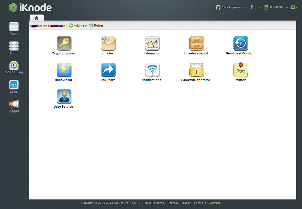
New Dashboard

The Login Page

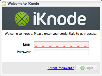
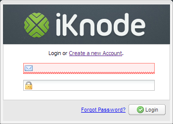
The first thing we tackled was the login. We felt the login seems old and resembled a Desktop application. The login is important, because this is the first thing you see when you log into iKnode. It had to be cleaner and attractive. So we remove most of the text, focused on making the login screen more iconic and easier to understand.

Old Login New Login

Instead of having the word “Email :” next to the email field we added an email icon, and next to the password field a lock. By removing the field labels the login screen automatically looked more pleasing and inviting, so we knew we were going in the right direction. We also simplified the welcome message. Nobody really reads it or pays attention to it, so we made it more functional; instead of a welcome message we replaced it with “Login or Create a new Account”.

Before you could only create an account from the main site, but we noticed that some tried to create an account directly from the login, so we added the link to the login.


The Sidebar

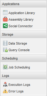
The second thing we focused our attention to was the ever growing sidebar. It had too many options and only a handful of options were really being used. But the biggest problem was that the sidebar didn’t make it clear what features were offered. Too many choices, and not a clear part on where to start.

Old Sidebar New Sidebar

With the new sidebar we make clear that we have 3 main features: Backend Apps, Data Storage and Scheduling. The order is also set to let the user know where to start. The first thing to do in iKnode is create an App. Then create Data Stores and if needed Schedule some apps to run at a specified period in time.

The new sidebar also improves the usage for mobile devices where screens are smaller. For this iteration we focused completly on tablets like the iPad, Nexus 7 and the Surface RT. The sidebar buttons are now big enough for a very precise finger button click, when before you usually needed to zoom in.

Additionally we removed the “Feedback & Support” floating tab and added it to the sidebar. This decision was made to unify the design, the tab always looked out of place. With the Support button as part of the sidebar it feels more accessible and consistent.


The Topbar

The third place we focused our attention to was the top bar. This top bar has changed considerably since iKnode started. In this time, we made the top bar a kindda scoreboard. We had the metrics on the dashboard before, but nobody really saw them, because most users spent their time coding in the editor. So we moved the stats to the top where they are visible no matter where you are in the site.

Old Topbar New topbar

The Application List

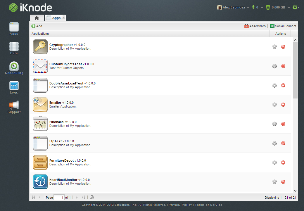
The fourth item we decided to improve was the Application List. The application list used to look like a small desktop grid, which made usage in tablets very complicated because of the size of each row. What we decided to do was make the grid line higher and wider, with big buttons at the end. It still needs improvement, but the this is a start. We also added the Application icon to make applications easier to identify.

New App List

The Editor

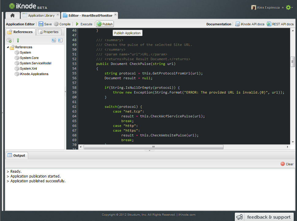
The fifth place and one of the most important ones is the editor. We have been working tirelessly to make the editor more usable. We are using ACE and for sometime we used a really old version of it. In the past month Jorge decided to put some love into the editor integrating the latest version of ACE and adding some well deserved keyboard bindings. It was frustrating to save an app by cliking the button. I usually save my code everytime I finish a line, which means that my development time was impacted considerably.

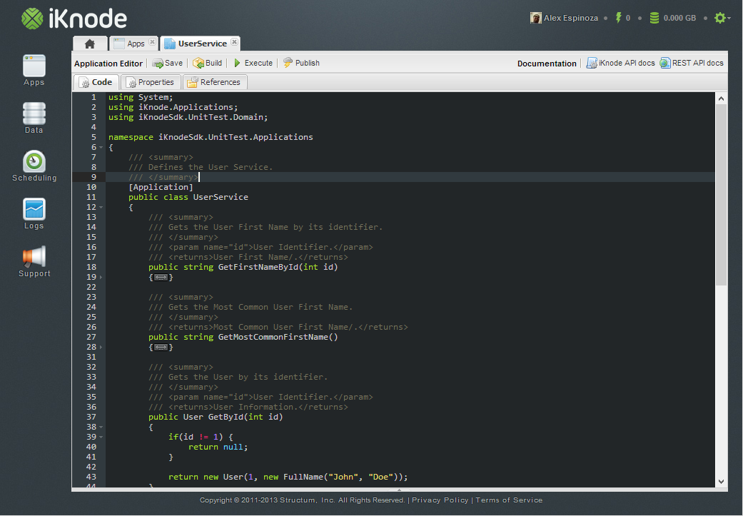
Old Editor New Editor

So in the editor, we first focused on making the code editor itself larger, so that we can focus on the code. The references and Properties that were part an editor sidebar were only used around 5% of the time, where the editor was used approximately 95% of the time. Additionally I am an avid Emacs user, and I love the simplicity of the editor with no toolbar, sidebar or anything else.

In order to achieve what a lot of developers call the “Zen Mode” we had to allow the editor to take the rest of the screen. So we moved the References and Properties tabs out of the way. We created a tab for the editor, one for the references and one for the properties. This made a hell of a difference. It feels like Emacs, and I love it.

We also changed the icons. We felt the Disk icon, which reprented the save process, was outdated. I think the Disk is no longer the best way to represent the save operation, so we changed to a Server Save icon.


This UI improvement experience was amazing. We had been so focused on pumping up our infrastructure that we overlooked the user interface. We put a lot of heart and love into iKnode, most of the time it can’t be seen with the naked eye, but in this case, it is out there for everybody to enjoy.

Please let use know your thoughts about the new changes.